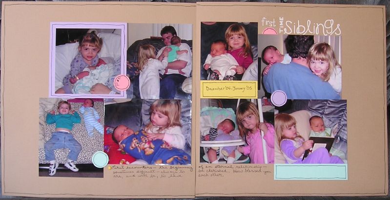
"first time siblings"

Layout for this week's Scrappaydivas challenge: don't use patterned paper. Looked in my copy of Step Up Your Scrapbooking (see my review of it here) for inspiration, and, because of that ended up not using a lot of product, though there are so many choices... it's just I always look to my paper files first (since I have SO MUCH OF IT, and it needs used...). So it was interesting. You can see the Shelly Laming draw-in-outlines influence; I think I like it.
Like the subtle visual triangles of color? The circles with the clothing colors? Ah, be impressed! Or don't, fine. See if I care... : )
Supplies -
cardstock: Bazill & Die Cuts with a View
pens: Zig millenium, .05; white Galaxy marker, American Crafts
alpha stickers: American Crafts
"first" sticker: Bo Bunny Press

Post a Comment